
Bucks fans jump ugly on the new Bucks logo
 I guess I assumed the Bucks old logo was so depressing and such a visual mismatch (Celtic Green and Laker Purple? -- thanks for the inspired combo, Dunleavy), that Bucks fans would naturally and immediately embrace just about anything else. Not so, I guess. Reading the various 'What do you think of the new logo?' internet forums, it seems Bucks Nation is not impressed. I'll summarize the criticisms.
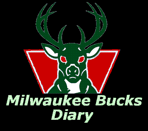
1. Weak Effort, Herb
A lot of people are very disappointed that the new logo is essentially the old logo with new colors. To those who take this position, the new logo represents a failure of imagination. I don't think this is a very fair criticism, though. The Bucks said all along that they were "updating" the logo, which does fairly imply a tweaking rather than an overhaul. I think the point of the whole exercise was just to get rid of the purple and introduce red, not to remake the entire design. Nonetheless, some fans called for Larry Harris and the entire design team to be fired (Don't logo designs originate in the NBA front office? For some reason I think that's how it works. Correct me if I'm wrong.) Personally I like the sense of continuity. I hate how the Brewers just throw out logos every four or five years. I'm glad the Bucks aren't following suit.
2. Milwaukee is not a suburb of Chicago
A second criticism that arose in the forums is one that I myself expressed in my earlier postings. The red primary, when combined with the preexisting and obviously Chicago Bulls' influenced deer head logo, comes dangerously close to being a pale imitation of our brothers to the south. This is a fair criticism. The Bucks have to be very careful to distinguish their uniforms in such a way that they don't appear to be 'Michael Jordan Wannabes'. I think they can and I hope they will. This criticism is quite valid.
3. Christmas is an ugly time, apparently
The overwhelming criticism, and I must say I raised it earlier as well, is that the colors are too "Christmasy". Now, I will grant you, one of the greatest faux pas you can make in your personal attire is combining red and green anytime outside of the day before Christmas. However, most sports team color combinations are that way. If you went to work in orange and black, I guarantee someone will yell "Pumpkin power!" at you. But when employed properly in a team's color scheme, black and orange can look very cool. The same with Green and Yellow. If you tried it as a personal combination, you'd look like a Sprite can, but when combined in a football uniform, its a classic. So, I guess it depends how they go about combining the colors that will determine whether the combination will lead to garishness or coolness. I'm willing to wait on that one too.
My Take
I guess I am neither overjoyed nor underwhelmed by the new logo. It is what it is in my mind. And what it is, is a departure from the Dunleavy scheme so I like it just for that. As I said above, I respect the use of continuity, but that said, I will concede the overly familiar design does breed a bit of a "ho, hum" reaction when you first see it. But I think the whole point of the change was to change the uniforms. And I think the uniforms are going to look very cool. I still believe they will closely resemble the prototypes I hamhandedly put together in my earlier post. All the signs point to designs of that sort, and if so, having at least gotten a visual idea from my renderings, I think were in for a bold new look that Bucks fans will enjoy.
Anyway, I always secretly hated the purple-green combo, so almost anything short of lime green-hunter green (that god awful mess they wore in the early 90s) would have been okay by me.
posted by Ty Will @ Thursday, June 29, 2006
![]()
![]()

0 Comments:
Post a Comment
<< Home